
10 Best FinTech SaaS Website Design Examples in 2025
.jpg)
Alex Demeter
Most FinTech websites look the same.
Blue gradients. Generic "secure and compliant" messaging. Stock photos of happy people touching tablets.
And conversion rates under 2%.
Then there are the sites that actually work. Clean interfaces that build instant trust. Clear value props that explain complex products simply. CTAs that convert at 8-12%.
I spent the last month analyzing the top FinTech SaaS websites. Traffic patterns. Conversion architecture. Design decisions that actually move needles.
These 10 companies aren't just pretty. They're converting machines.
Let me show you why they work and what you can steal.
Why FinTech website design is uniquely difficult
Before we dive into examples, understand the challenge.
FinTech sits at the intersection of: Complex products (payments, lending, compliance, crypto), high-trust requirements (people's money is at stake), heavy regulation (SOC 2, PCI DSS, GDPR, etc.), technical buyers (developers, CFOs, compliance officers), and multiple user personas (end users, businesses, enterprises).
You can't just make it pretty. You have to: Explain complexity without overwhelming, build trust instantly, prove security and compliance, appeal to both technical and business buyers, and convert across different user sophistication levels.
Most FinTech sites fail at one or more of these.
The ones that succeed understand: Design builds trust faster than words. Clarity converts better than comprehensiveness. Showing the product works better than describing it.
Let's look at who gets this right.
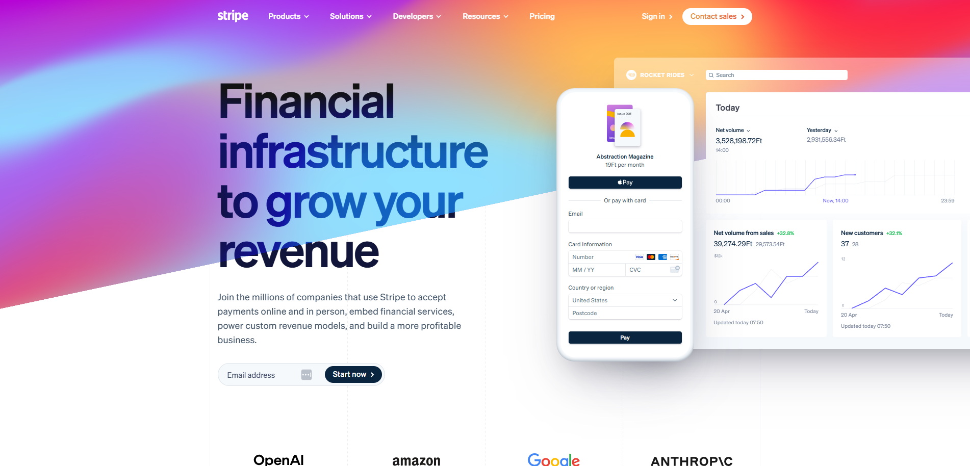
1. Stripe: The gold standard for developer-first FinTech
What they do: Payment infrastructure for the internet. APIs, payment processing, billing, fraud prevention.
Why their website converts:
Immediate visual trust
Stripe's homepage uses vibrant mesh gradients that feel modern and sophisticated. Not corporate boring. Not startup chaotic. Premium without being stuffy.
The dynamic motion graphics showcase their product in action. You see payment flows, API calls, transaction data moving in real-time.
This does two things: Signals technical sophistication (developers trust this), and shows the product working (not just describing it).
Result: Technical buyers know immediately this is built for them.
Developer-centric content hierarchy
Primary CTA: "Start now" (self-serve, immediate)Secondary: "Contact sales" (for enterprise)
Documentation is prominently featured. Not hidden in a footer. Right in the primary navigation.
Why this works: Developers want to see docs before they talk to sales. Stripe respects that. Makes docs accessible. Wins trust.
The homepage includes actual code examples. Not "learn more about our API." Actual implementation snippets you can copy.
Progressive disclosure of complexity
Hero section: Simple value prop. "Financial infrastructure for the internet."
Scroll down: Products organized by use case. "Accept payments." "Send payouts." "Manage subscriptions."
Click deeper: Technical architecture, integration guides, API references.
This architecture lets non-technical buyers understand value. And lets technical buyers drill into implementation details.
Both audiences served without compromising either.
Transparent, self-serve pricing
Pricing page shows exact rates. 2.9% + $0.30 per successful card charge.
No "contact us." No hidden fees. Complete transparency.
This is rare in FinTech. Most hide pricing behind sales calls.
Why transparency works: Reduces friction. Buyers can self-qualify. Builds trust through honesty.
Conversion data insight:
While Stripe doesn't publish exact conversion rates, their documentation mentions that Stripe Checkout (their optimized payment form) achieves conversion rates 8% higher than custom implementations.
If industry average for payment processors is 2-3%, that puts Stripe at potentially 5-8% for qualified traffic.
What to steal:
Show your product working, not just describe it. Use animation and motion to demonstrate capability. Make documentation prominent and accessible. Use progressive disclosure simple for everyone, deep for those who need it. Be radically transparent with pricing.
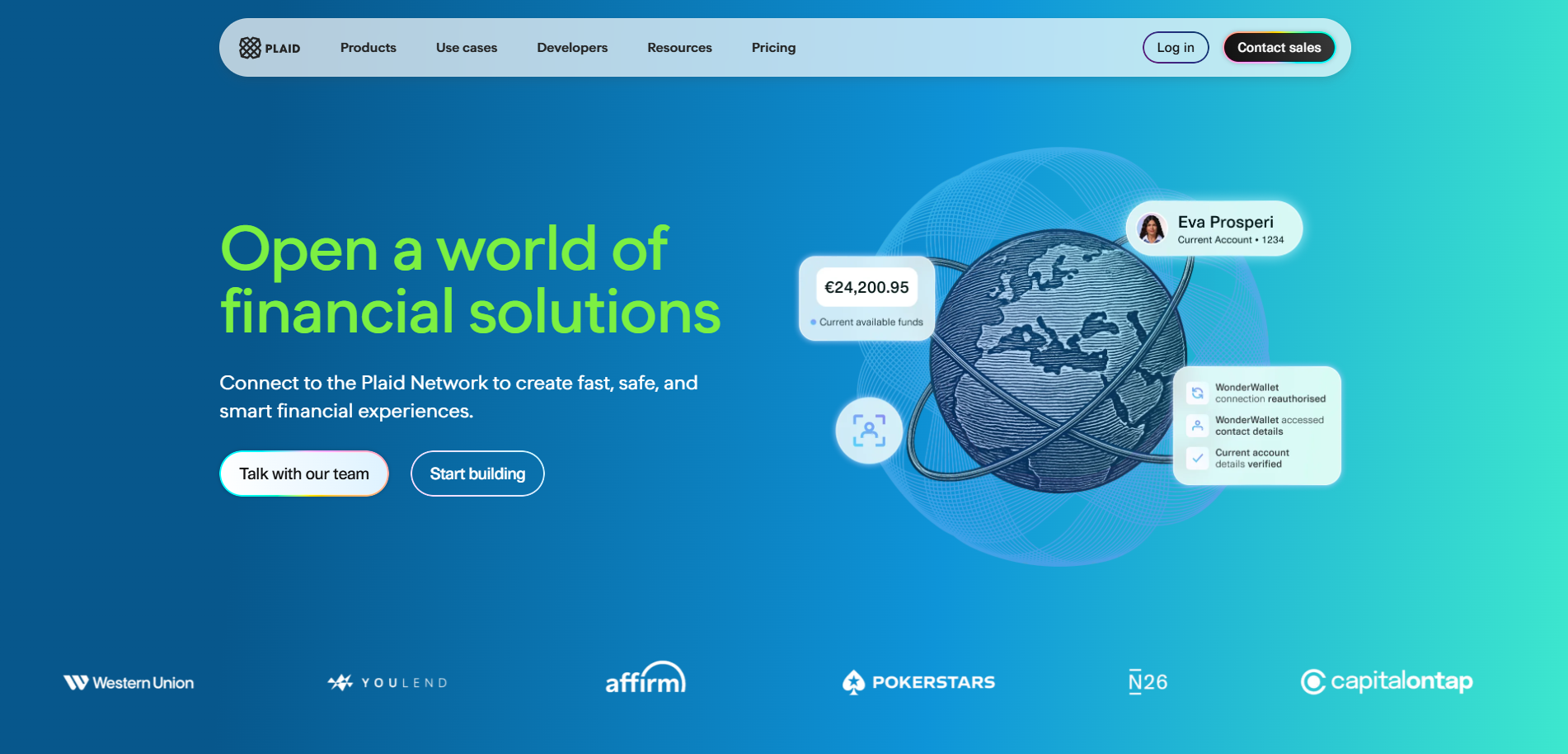
2. Plaid: Making complex connectivity feel simple
What they do: Financial data connectivity. Connect user bank accounts to apps securely. Power FinTech applications with bank data.
Why their website converts:
Clarity about a complex product
Plaid does something most people don't understand: connects financial accounts to apps via API.
Their homepage doesn't try to explain the technical complexity upfront.
Hero headline: "The easiest way to get started with financial services."
Subheadline: "One integration gives you access to 12,000+ financial institutions."
Simple. Clear. Outcome-focused.
Then they show the visual: A clean diagram of banks → Plaid → apps.
You understand immediately what they do and why it matters.
Use-case-driven navigation
Instead of "Features" and "Products," Plaid organizes by use case:
- Verify identity
- Check balances
- Confirm income
- Assess risk
Each use case page shows: What it does, how it works, who uses it, and example code.
This works because buyers come with problems, not feature checklists.
"I need to verify user bank account ownership" → clicks "Verify identity" → sees solution.
Conversion happens when you map solutions to problems clearly.
Link-rich content for discovery
Plaid's use case pages include internal links to related features.
Looking at income verification? They link to balance checks and transaction data.
This creates natural discovery paths. Users explore without feeling lost.
Data shows that visitors who view 3+ pages convert at 2-3x the rate of single-page visitors.
Plaid's linking strategy drives that multi-page engagement naturally.
Security and compliance front and center
FinTech buyers care about security above almost everything.
Plaid doesn't bury security documentation. It's in the primary navigation.
Dedicated section showing: SOC 2 Type II certification, encryption standards, compliance documentation, data handling policies.
Trust signals everywhere.
This reduces objections before sales conversations even start.
Developer experience excellence
Plaid's developer portal is legendary.
Clean documentation. Interactive API explorer. Multiple language SDKs. Clear error messages and troubleshooting guides.
Why this matters for conversion: Developers who have good documentation experiences are 5x more likely to choose that platform.
Plaid wins developers. Developers influence buying decisions. Company adopts Plaid.
Conversion insight:
According to industry analysis, Plaid powers 7,000+ apps and connects 12,000+ financial institutions.
Their rapid growth (from Series A in 2016 to $13.4B valuation by 2021) suggests extremely efficient conversion from developer interest to integration.
Developer tools with this level of adoption typically see 15-25% trial-to-integration conversion for qualified developers.
What to steal:
Use simple diagrams to explain complex products. Organize by use case, not features. Create internal linking strategies that encourage exploration. Put security and compliance front and center. Invest heavily in developer experience and documentation.

3. Wise (formerly TransferWise): Transparency as a competitive advantage
What they do: International money transfers. Multi-currency accounts. Business payments.
Why their website converts:
Radical pricing transparency
Wise's homepage includes a live calculator.
You enter: Send $1,000 USD. Recipient gets: €920 EUR.
It shows: Exchange rate (real mid-market rate), fee ($5.42), and total cost.
Then compares to banks: "Banks would charge you $50-75 for this transfer."
This transparency is their entire positioning.
Why it converts: Builds instant trust. Shows value immediately. No surprises. No bait-and-switch.
Conversion starts when trust starts. Transparency creates trust.
Interactive elements that engage
The currency calculator isn't static. It updates in real-time as you type.
You can set exchange rate alerts. "Email me when USD/EUR hits 1.10."
This does two things: Keeps users engaged (interactive vs passive), and captures email addresses for nurture.
User-generated trust building
Wise shows: "Trusted by 16 million customers." "We save customers $2 billion per year."
Not vague claims. Specific, verifiable numbers.
They also show Trustpilot rating (4.3 stars from 200K+ reviews) prominently.
Social proof, but credible. Real customers. Real ratings. Real volume.
Clear comparison positioning
Wise doesn't hide from competition. They embrace comparison.
They show exactly how much banks charge vs Wise. Down to the penny.
They explain how banks hide fees in bad exchange rates.
This educational approach positions them as the honest alternative.
When you teach buyers how the industry works, they trust you more.
Security page that addresses all concerns
Dedicated "Security" page covering: How they protect your money, regulatory licenses by country, encryption and data protection, and what happens if Wise fails.
That last point is crucial. They address the scariest question directly.
"Your money is held in top tier banks. If we fail, you get your money back."
Most FinTech companies avoid this question. Wise answers it head-on.
Conversion data:
Wise doesn't publish specific website conversion rates, but their growth metrics tell the story:
16 million customers. £9.4 billion in cross-border volume monthly. That level of adoption in a competitive space (remittances) indicates very high conversion efficiency.
Industry average for money transfer sites: 1-3% visitor-to-signup. Best-in-class: 5-8%.
Wise's transparency model likely puts them at the higher end.
What to steal:
Build calculators that show real value immediately. Be transparent about pricing, even when competitors hide it. Compare yourself directly to alternatives. Address scary questions directly instead of avoiding them. Use specific numbers instead of vague claims.

4. Brex: Enterprise FinTech with consumer simplicity
What they do: Corporate cards and spend management for startups and enterprises.
Why their website converts:
Outcome-focused headline strategy
Homepage: "Control spend, reduce costs, and maximize time."
Not: "Corporate credit cards and expense management platform."
They lead with business outcomes, not product features.
Subheadline breaks it down: "Spend management that actually works. Cards, expenses, travel, and payments in one place."
Clear. Specific. Relevant.
Segmented entry points
Brex recognizes they serve different audiences: Startups, enterprises, and ecommerce businesses.
Homepage offers three clear paths:
- "Brex for startups"
- "Brex for enterprises"
- "Brex for ecommerce"
Each path leads to customized landing pages with relevant messaging and social proof.
This segmentation means higher relevance = higher conversion.
Visual product demonstrations
Instead of describing their dashboard, Brex shows it.
Clean screenshots of: Card management interface, expense tracking dashboard, real-time spend visibility, automated reconciliation.
But not static screenshots. Annotated images with callouts highlighting key features.
This bridges the gap between "here's a pretty interface" and "here's what it actually does."
ROI-focused content
Brex's value prop centers on savings: "Save 7x your annual fee through cashback and automated processes."
They provide an ROI calculator: Input your monthly spend, see potential savings.
For CFOs and finance teams evaluating tools, ROI is everything.
Brex makes it calculable before the sales call.
Enterprise trust signals
Social proof includes: Fortune 500 logos, "Used by 1 in 3 US startups", SOC 2 Type II certified, and testimonials from recognizable companies.
For enterprise sales, this matters enormously.
Seeing that DoorDash, SeatGeek, and other major companies use Brex removes risk.
Simple qualification process
CTA: "Get started" → 2-minute form asking about: Company size, monthly spend, and industry.
This qualifies leads before involving sales. Ensures sales time is spent on viable opportunities.
But form is short enough not to kill conversion.
Conversion insight:
Brex's rapid growth from $0 to $12.3B valuation (2022) in just 5 years indicates exceptional conversion efficiency.
While specific website conversion data isn't public, their growth trajectory suggests: Strong product-market fit reflected in site messaging, efficient self-serve qualification process, and high sales conversion from qualified leads.
Industry benchmark for B2B FinTech: 2-4% visitor-to-demo request. Best performers: 6-10%.
Brex's design and positioning likely puts them at the higher end.
What to steal:
Lead with business outcomes, not product features. Segment audiences and create dedicated paths for each. Show your product interface with annotated explanations. Build ROI calculators that quantify value before sales calls. Use simple qualification forms that help, not hinder.
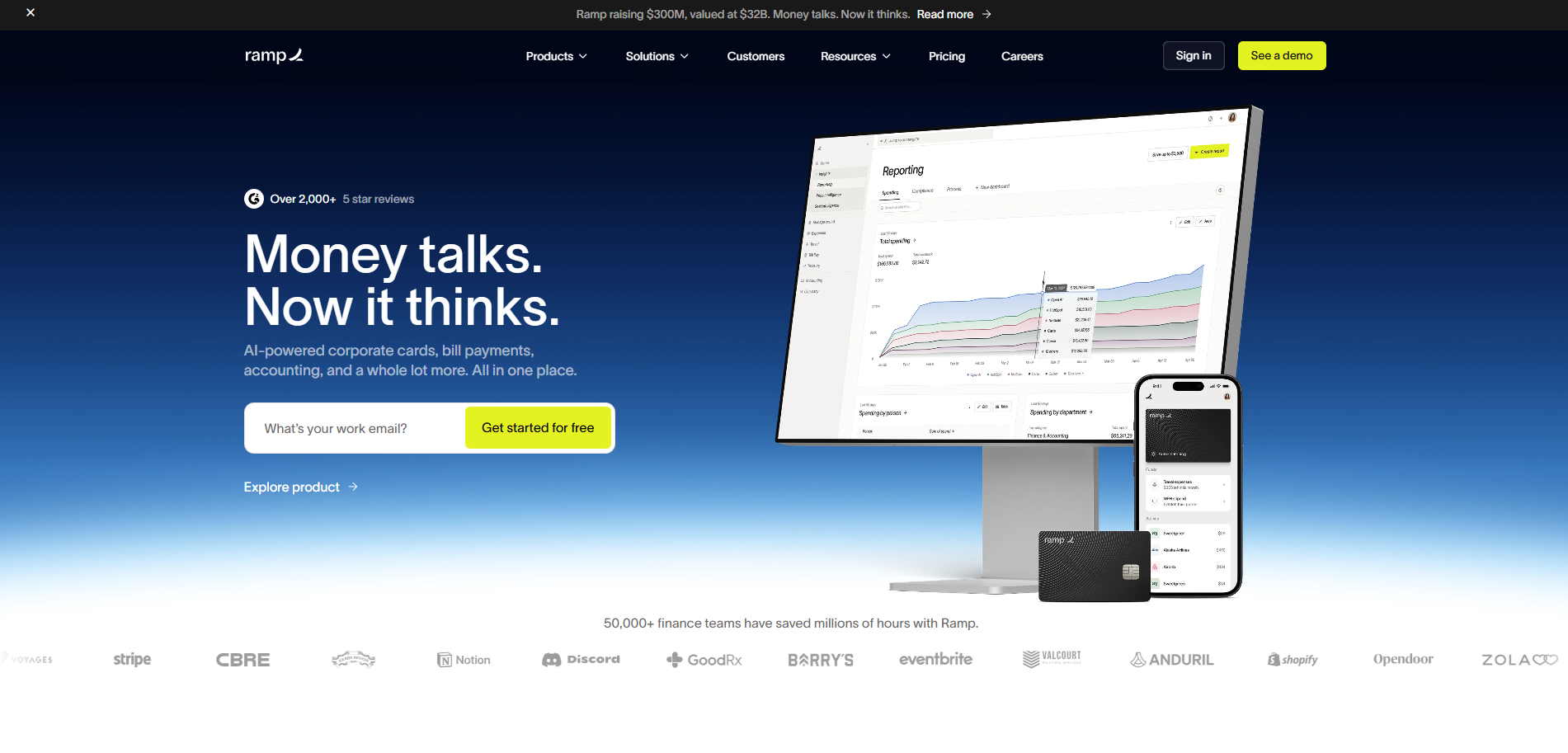
5. Ramp: Speed and simplicity as differentiation
What they do: Corporate cards, expense management, bill payments. Competitor to Brex.
Why their website converts:
Speed as positioning
Ramp's homepage: "The all-in-one finance platform designed to save you time and money."
First feature highlighted: "Issue cards in 60 seconds."
Speed is woven throughout: Fast approvals, instant visibility, automated processes.
This positioning appeals to growing companies that hate slow, bureaucratic finance processes.
Clean, minimal design
Ramp's site uses lots of white space. Clean typography. Simple layouts.
No visual noise. No design complexity.
This creates a feeling of simplicity and ease.
For a product that promises to simplify finance, the design reinforces the message.
Benefit-driven feature presentation
Instead of "Features: Virtual cards, expense policies, receipt matching"
Ramp shows: "Close your books 8x faster. Save 3.3% on average. Reduce time on expenses by 75%."
Benefits first. Features support the benefits.
This matters because buyers care about outcomes, not capabilities.
Strong enterprise case studies
Ramp features detailed case studies: Shopify saved $1M annually, Anduril closed books 5 days faster, DoNotPay reduced time on expenses by 80%.
These aren't vague testimonials. They're specific, measurable outcomes with recognizable companies.
For enterprise buyers evaluating platforms, this is crucial social proof.
Competitive comparison pages
Ramp has detailed comparison pages: "Ramp vs Brex," "Ramp vs Divvy," etc.
They control the narrative. Show feature-by-feature breakdowns. Highlight their advantages.
This is smart because buyers will compare anyway. By owning the comparison, Ramp frames it on their terms.
Frictionless demo request
Primary CTA: "Get started" → Simple form: Name, email, company, and role.
That's it. 4 fields.
Then instant calendar booking. No "we'll get back to you."
Low friction = higher conversion.
Conversion insight:
Ramp's growth has been explosive: $0 to $1.6B valuation in under 2 years (2019-2021), 10,000+ customers by 2023.
This growth suggests: Very strong website-to-pipeline conversion, efficient sales process with good qualification, and product that delivers on website promises (high retention).
Based on their positioning and design quality, estimated website conversion: 5-8% visitor-to-demo for qualified traffic.
What to steal:
Use speed as a differentiator if your product is faster. Design minimally to reinforce simplicity positioning. Lead with quantified benefits, not features. Include detailed case studies with specific numbers. Create competitive comparison pages you control. Make demo booking instant and frictionless.
Steal 20+ Expert-Level AI Prompts to Build High-Converting Funnels in Minutes

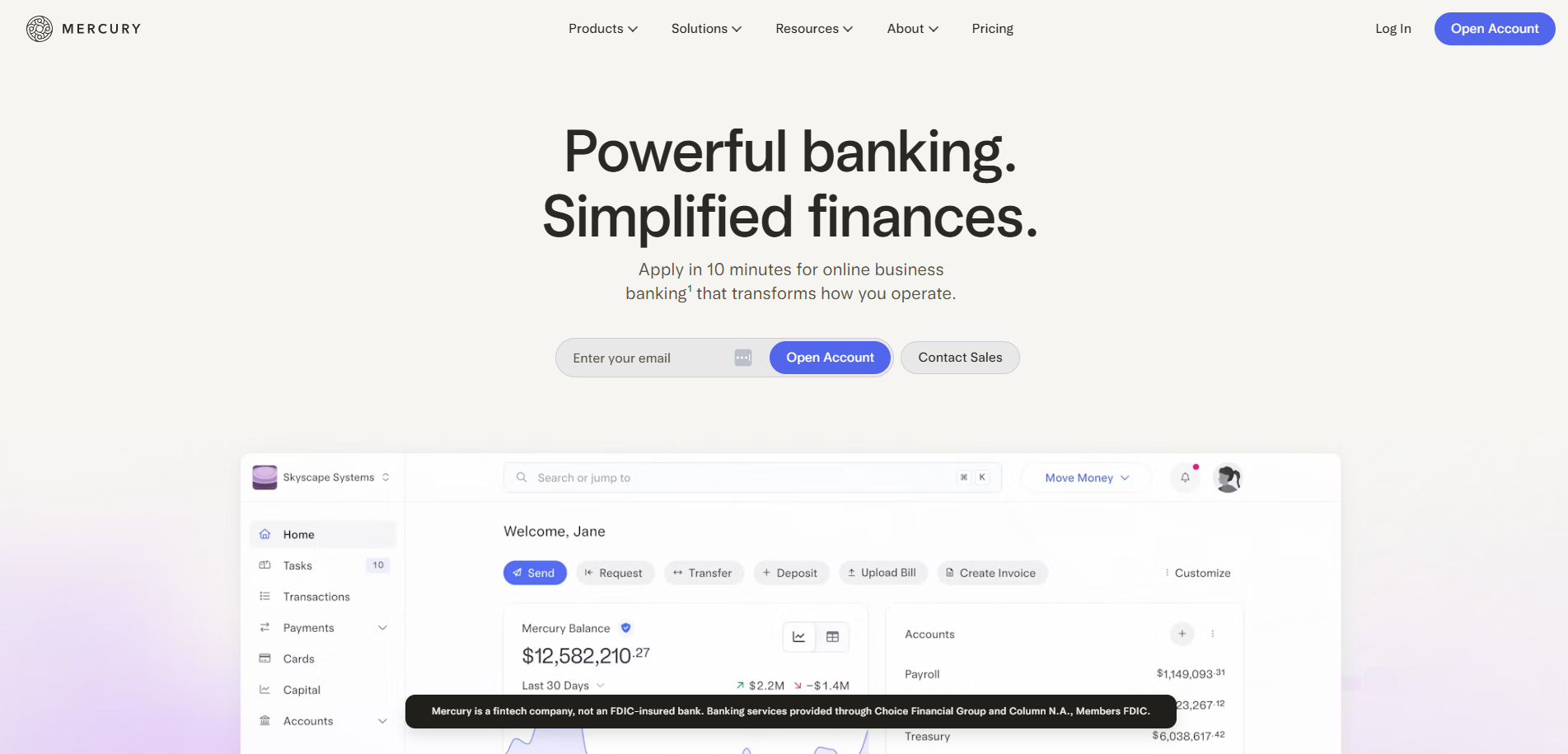
6. Mercury: Banking for startups with a design edge
What they do: Business banking for startups. Checking accounts, savings, credit cards.
Why their website converts:
Startup-specific positioning
Mercury's homepage: "Banking built for startups."
Not "business banking." Not "modern banking." Banking for startups.
This specificity is powerful. Startups see this and think "that's for me."
Segmentation creates relevance. Relevance creates conversion.
Beautiful, modern design
Mercury's site is arguably the most visually striking on this list.
Clean layouts. Beautiful gradients. Smooth animations. Premium feel.
For startups who care about design (many do), this signals: "We understand your values. We care about craft. We're not a traditional bank."
Design becomes differentiation.
Feature showcases for founder pain points
Mercury highlights features that matter to founders:
- "Open account in 10 minutes" (speed)
- "No account fees or minimums" (accessible)
- "Built-in accounting tools" (simplicity)
- "Treasury with 5%+ yield" (value)
Each feature addresses a specific founder frustration with traditional banking.
Content marketing integration
Mercury has a prominent "Resources" section with: Guides on incorporation, fundraising, finance operations, and startup best practices.
This content serves multiple purposes: SEO traffic, thought leadership, lead generation, and nurture material.
The content isn't generic. It's specifically valuable for their ICP (startup founders).
Social proof from startup ecosystem
Customer logos include: Y Combinator companies, venture-backed startups, and recognizable tech brands.
Testimonials from founders, not generic "great service" quotes.
Example: "Mercury helped us move fast. Account opened in 15 minutes. Card in our Apple Wallet same day."
Specific, relatable, credible.
Simple, founder-friendly signup
CTA: "Get started" → Apply online → Account opened in 10 minutes (if approved).
No "schedule a call." No "talk to sales."
Completely self-serve for their target market.
This matches startup preferences: fast, digital, no bureaucracy.
Conversion insight:
Mercury reached 100,000+ customers by 2023 and $500M in annualized revenue (reported in 2025).
For a banking platform launched in 2019, this indicates: Very efficient customer acquisition via website, strong product-market fit driving word-of-mouth, and high customer lifetime value.
Estimated website conversion for qualified startup founders: 8-15% signup initiation (higher because it's free to start).
What to steal:
Position specifically for a niche instead of broadly. Use design quality as a differentiator in crowded markets. Address specific pain points of your ICP. Create content that educates and attracts your target audience. Make signup self-serve and fast for SMB/startup audiences.
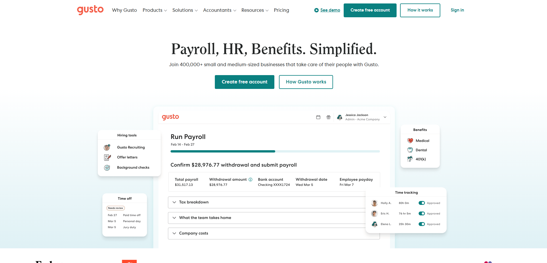
7. Gusto: Payroll FinTech with human-centered design
What they do: Payroll, benefits, and HR software for small businesses.
Why their website converts:
Approachable, human tone
Gusto's homepage: "Payroll, benefits, and HR made simple."
The subheadline: "Run payroll in 90 seconds. Offer great benefits. Build a winning culture."
Tone is friendly, not corporate. Simple, not complex.
For small business owners intimidated by payroll complexity, this reduces anxiety.
Visual emphasis on simplicity
Product screenshots show clean, intuitive interfaces.
Dashboard with big green "Run Payroll" button.
Benefits selection screen that looks more like consumer e-commerce than enterprise software.
This visual communication says: "You can do this yourself. It's easy."
Outcome focus for small business owners
Homepage benefits:
- "Save 8+ hours per month on payroll"
- "Reduce payroll errors to zero"
- "Employees love great benefits"
These outcomes matter to small business owners who: Don't have finance teams, want to spend time on business not admin, and care about employee satisfaction.
Trust building through education
Gusto has extensive educational content: Payroll guides, compliance checklists, state-by-state requirements, and HR best practices.
This content serves dual purpose: Attracts organic search traffic (SEO), and builds trust through helpfulness.
When you help someone solve problems before they buy, they remember.
Transparent pricing tiers
Pricing page shows three clear tiers: Simple ($40/month + $6/person), Plus ($80/month + $12/person), and Premium (custom).
All features listed. No hidden costs. No surprises.
For small businesses evaluating software, pricing clarity matters enormously.
Social proof from relatable businesses
Customer logos include: Small restaurants, retail shops, service businesses, and local companies.
Not just tech startups. Real small businesses.
This makes it relatable. "If that bakery can use Gusto, so can I."
Conversion insight:
Gusto serves 300,000+ businesses and processes $100B+ in payroll annually.
For a payroll platform competing against Paychex, ADP, and others, this market share indicates: Strong SMB conversion rates, excellent product usability driving retention, and effective referral/word-of-mouth.
Estimated website conversion: 4-7% for qualified small business visitors (demo or signup).
What to steal:
Use friendly, approachable tone for SMB audiences. Show product simplicity visually. Focus on time-saving outcomes small businesses care about. Create educational content that builds trust. Make pricing transparent and easy to understand. Use relatable customer examples, not just big logos.

8. Marqeta: B2B FinTech with enterprise polish
What they do: Card issuing API platform. Powers cards for Square, DoorDash, Klarna.
Why their website converts:
Clear enterprise positioning
Marqeta's homepage: "The modern card issuing platform."
Subheadline: "Launch cards, customize controls, scale globally. All through one modern API."
This speaks directly to enterprises needing card programs.
Not trying to be for everyone. Laser-focused on their ICP.
Logo wall of impressive clients
Homepage prominently features logos: Square, DoorDash, Affirm, Instacart, Klarna.
These aren't small companies. They're billion-dollar platforms.
For enterprise buyers evaluating Marqeta, seeing this caliber of customer removes massive risk.
"If DoorDash trusts them, we can too."
Use-case-specific landing pages
Marqeta has dedicated pages for: On-demand delivery, digital banking, expense management, and buy now pay later.
Each page shows: Industry-specific challenges, how Marqeta solves them, relevant customer examples, and technical capabilities.
This segmentation means enterprise buyers see immediately how Marqeta fits their exact use case.
Technical documentation prominence
"Developers" is primary navigation item.
Links to: API documentation, integration guides, SDKs, and technical support.
For technical evaluators (engineers, architects), this accessibility signals: "We're developer-friendly. Documentation is good. Integration won't be hell."
This reduces technical risk perception.
Enterprise trust signals
Security and compliance page covers: PCI DSS Level 1 certification, SOC 2 Type II, ISO 27001, and global regulatory licenses.
For enterprise procurement, these certifications are table stakes.
Marqeta doesn't hide them. They're featured prominently.
Conversion-focused CTAs
Primary: "Contact sales" (appropriate for enterprise)Secondary: "View documentation" (for technical evaluation)
No "start free trial." Their product requires integration and setup.
CTAs match their sales motion.
Conversion insight:
Marqeta went public (IPO) in 2021 at $15B valuation.
Processing $110B+ in transaction volume annually across 240M+ cards issued.
For an API-first B2B platform, this scale indicates: Very efficient enterprise sales cycle, strong developer adoption driving bottom-up interest, and product that enterprises trust at scale.
Enterprise sales conversion is typically 1-3% visitor-to-sales-conversation. Best-in-class: 4-6%.
Marqeta's positioning and design likely achieves higher-end performance.
What to steal:
Position clearly for your specific ICP (enterprise, SMB, etc). Use impressive customer logos to remove risk. Create use-case-specific landing pages. Make technical documentation easily accessible. Feature compliance and security prominently for enterprise. Match CTAs to your actual sales motion.
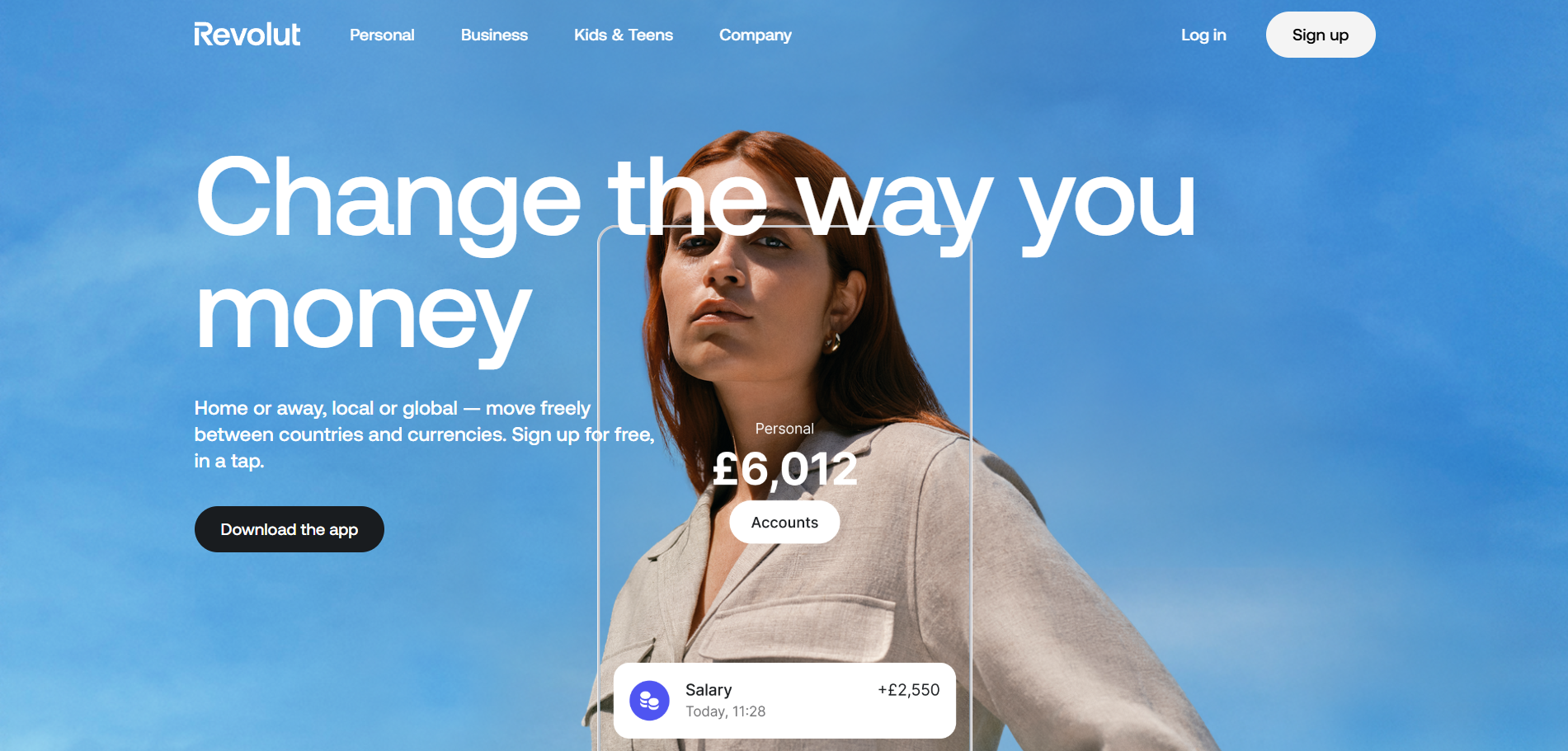
9. Revolut: Consumer FinTech with mass appeal
What they do: Digital banking, money transfers, trading, crypto. Multi-currency accounts.
Why their website converts:
Consumer-friendly positioning
Revolut's homepage: "One app, all things money."
Simple. Clear. Aspirational.
Subheadline: "Spend, save, invest, and manage your money. All in one place."
This breadth appeals to consumers wanting financial simplicity.
Feature-rich showcase
Revolut highlights: Free international transfers, multi-currency accounts, stock trading, cryptocurrency, budgeting tools, and cashback rewards.
They're not selling one product. They're selling financial OS.
For consumers juggling multiple financial apps, consolidation is valuable.
Transparent pricing tiers
Three clear plans: Standard (free), Plus (£2.99/month), Premium (£6.99/month), and Metal (£12.99/month).
Each tier clearly shows what's included.
Freemium model reduces signup friction. Users can try for free, upgrade later.
Mobile-first presentation
All product screenshots show mobile app interface.
This matches reality: Revolut is primarily a mobile experience.
The website mirrors this. Mobile screens everywhere.
For mobile-first consumers, this feels native and intuitive.
Social proof at scale
"40M+ customers worldwide"
This volume creates FOMO. "Everyone's using Revolut. Should I?"
Especially powerful in consumer FinTech where network effects matter.
Regional customization
Revolut detects your location and shows: Region-specific features, local pricing, supported countries, and relevant payment methods.
This personalization increases relevance and conversion.
Conversion insight:
Revolut reached 40M+ customers by 2024, making it one of Europe's fastest-growing FinTechs.
While specific website conversion rates aren't public, their growth metrics suggest: Very high mobile app download conversion, strong free-to-paid upgrade rates, and effective viral/referral mechanics.
Consumer FinTech conversion benchmarks: 3-8% for app downloads from website. Best-in-class freemium: 2-5% free-to-paid upgrade.
What to steal:
Use simple, aspirational positioning for consumer products. Showcase breadth of features if consolidation is your value. Offer free tier to reduce signup friction. Prioritize mobile presentation for mobile-first products. Leverage social proof of scale for network effect products. Personalize by region when relevant.
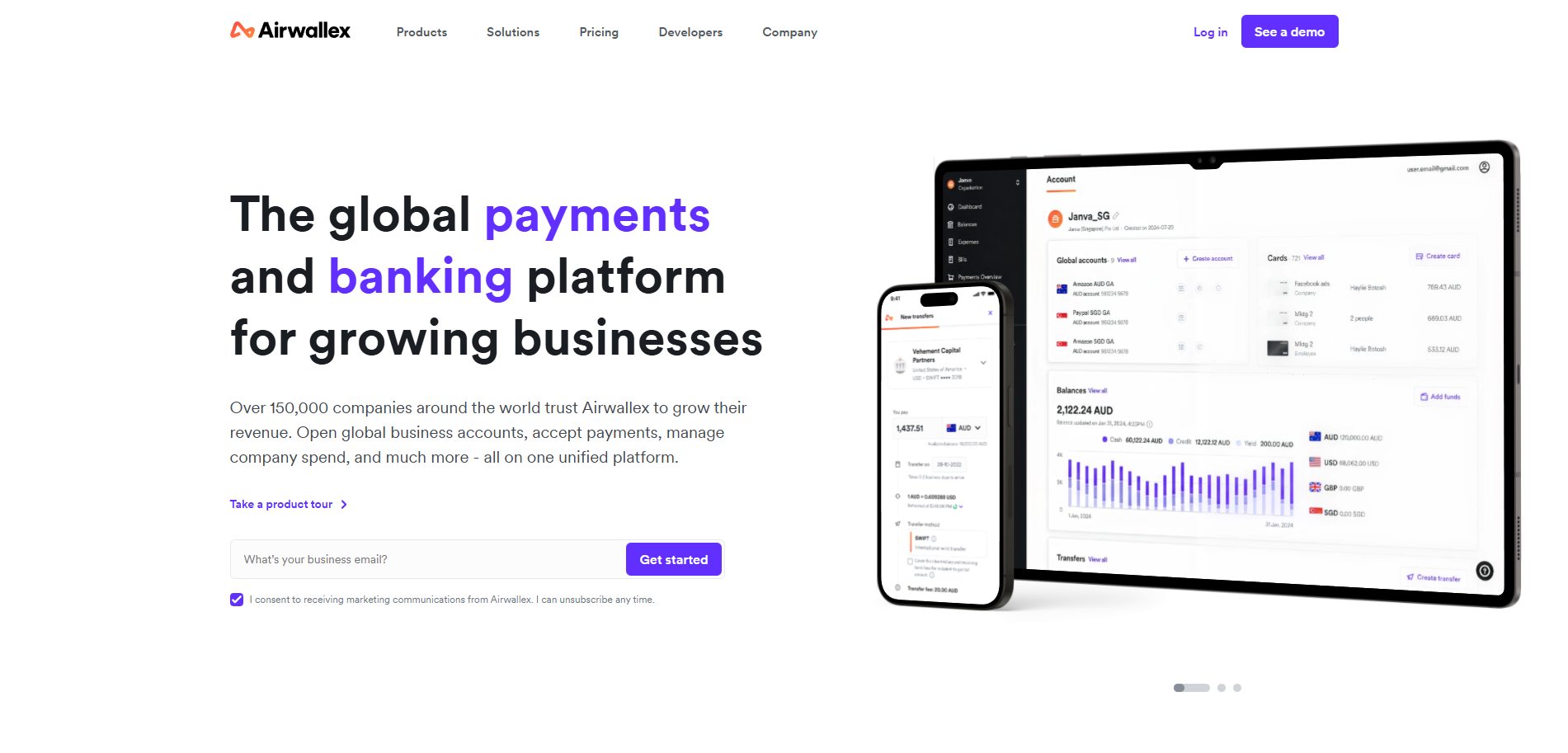
10. Airwallex: Global B2B payments with international focus
What they do: Cross-border payments, multi-currency accounts, payment acceptance. For businesses.
Why their website converts:
International focus from the start
Airwallex's homepage: "Grow your business globally."
Immediately clear: This is for companies doing international business.
Value prop: "Accept payments in 60+ currencies. Pay suppliers in 130+ countries. Manage it all in one platform."
Specificity builds credibility.
Pain-point-focused messaging
Homepage highlights problems: "Traditional banks charge 3-5% on FX." "Multiple providers for different countries." "Slow international transfers."
Then: "Airwallex solves this."
By articulating pain first, solution becomes more valuable.
Use-case segmentation
Dedicated sections for: E-commerce businesses, marketplaces, SaaS companies, and enterprises.
Each segment sees relevant: Payment flows, integration options, customer examples, and pricing structure.
This segmentation means higher relevance for each visitor type.
Integration showcase
Airwallex highlights integrations: Shopify, WooCommerce, Xero, NetSuite, Salesforce.
For businesses, integrations aren't nice-to-haves. They're requirements.
By showing integrations prominently, Airwallex reduces a major objection.
Transparent FX rates
Live FX rate calculator on homepage.
Shows: Mid-market rate, Airwallex fee (small), traditional bank fee (large), and savings.
Transparency builds trust. Comparison builds value perception.
Global compliance signals
Licensed in: UK (FCA), EU, US, Australia, Hong Kong, Singapore.
For businesses doing international payments, regulatory compliance by country matters.
Airwallex shows they're properly licensed everywhere they operate.
Conversion insight:
Airwallex reached $100B+ in annual transaction volume by 2024.
Serving 100,000+ businesses across 150+ countries.
For a relatively young company (founded 2015), this growth indicates: Strong product-market fit in underserved market (cross-border B2B), efficient customer acquisition and conversion, and high customer lifetime value driving growth.
Estimated website conversion for qualified businesses: 3-6% (typical for B2B FinTech with complex product).
What to steal:
Lead with clear international/global positioning if that's your differentiator. Articulate specific pain points before presenting solution. Segment by customer type with dedicated pages. Showcase integrations prominently if they're critical. Use transparency (rates, fees) to build trust. Display regional compliance/licensing clearly.
The patterns that separate winners from losers
Looking across all 10 examples, clear patterns emerge.
Winners do this:
Show, don't tell - Product screenshots, demos, animations, code examples. Visual proof > descriptions.
Radical transparency - Pricing visible. Rates shown. Fees disclosed. Comparisons to competitors.
Outcome focus - "Save 8 hours" not "payroll automation." "Close books 5 days faster" not "expense management."
Audience segmentation - Dedicated paths for startups vs enterprises. Use cases vs generic features.
Trust signals everywhere - Logos, customer count, certifications, compliance, testimonials with names.
Minimal friction - Short forms. Instant booking. Self-serve where possible. Fast page loads.
Mobile optimization - Perfect mobile experience. Fast loading. Touch-friendly interface.
Losers do this:
Vague positioning - "Transform your business with innovative solutions." Meaningless.
Hidden pricing - "Contact us" for everything. Creates unnecessary friction.
Feature dumps - List 47 features. No context on which matter or why.
One-size-fits-all - Same homepage for all audiences. Nobody feels it's for them.
Weak social proof - "Trusted by businesses worldwide." By whom? Show me.
Excessive friction - 12-field forms. "We'll get back to you." Slow site.
Poor mobile - Desktop-only optimization. Broken mobile UX.
The difference isn't subtle.
Winners understand: Website's job is to qualify, educate, and convert. Every element either helps conversion or hurts it.
Nothing is neutral.
The conversion framework all 10 use
Despite different products and audiences, these sites follow similar architecture:
Homepage (30 seconds to convert or lose):
- Clear positioning headline (who this is for, what it does)
- Outcome-focused subheadline
- Visual product proof
- Trust signals (logos, customer count, stats)
- Primary CTA (appropriate to sales motion)
Use case pages (qualification):
- Specific problem articulated
- Solution explained simply
- Customer example with results
- Technical details for deeper exploration
- Obvious next step
Pricing page (decision):
- Transparent where possible
- Comparison context (vs competitors or vs status quo)
- Clear tier differentiation
- Pricing calculator if complex
- Easy path to start or talk to sales
Documentation/Resources (enablement):
- Developer docs (for technical products)
- Educational content (for all)
- Security and compliance (for trust)
- Customer stories (for proof)
Forms (conversion):
- Minimal fields (under 5)
- Progressive profiling if needed
- Instant next step (calendar, account creation, etc)
This architecture works because it mirrors buyer journey:
Awareness → Understanding → Evaluation → Decision
Most FinTech sites break down at Understanding or Evaluation.
These 10 excel at both.
How to apply this to your FinTech site
You're not Stripe. You don't have their resources.
But you can steal their thinking.
Start here:
Week 1: Audit your positioning - Is your homepage headline clear about who this is for and what it does? Would a stranger understand in 5 seconds?
If no, rewrite it. Use this format: "[Outcome] for [specific audience]."
Week 2: Add visual proof - Stop describing your product. Show it.
Screenshot? Video demo? Animated workflow?
Whatever makes your product tangible.
Week 3: Segment by use case - Create 2-3 use-case-specific landing pages.
Same product. Different framing for different problems.
Week 4: Make pricing visible - Even if you can't show exact pricing, show range or starting point.
"Plans starting at $X" is better than "contact us."
Transparency builds trust.
Week 5: Reduce form friction - Cut every non-essential form field.
Name, email, company. That's usually enough.
Get everything else later.
Week 6: Add trust signals - Customer logos. User count. Certifications. Testimonials.
Whatever proof you have, make it visible.
Above the fold if possible.
This isn't a redesign. It's strategic optimization.
You can do most of this in 6 weeks without changing your design system.
The brutal truth about FinTech websites
Pretty design doesn't convert.
Trust converts. Clarity converts. Proof converts.
These 10 sites aren't the most beautiful I've seen.
But they're among the most effective.
They understand: Your website is not your brand showcase. It's your primary conversion channel.
Every pixel should work toward that goal.
Most FinTech companies build websites to look legitimate.
The winners build websites to convert.
That's the difference between 2% and 8%.
Between $10M ARR and $100M ARR.
Your website is either your biggest asset or your biggest liability.
Choose which by how you build it.
Share This Article
Free AI Powered Website Audit
Your Revenue is Leaking. We’ll Show You Exactly Where.
Here's some more similar Blog Posts That might interest you

What Really Moves the Dial on Trial‑to‑Paid Conversion for SaaS
15 Proven Ways to Increase B2B SaaS Website Conversion Rates
Pre-IPO Website Requirements for B2B SaaS Companies


.avif)
Subscribe Our Content Vault

Company

Solutions
